A 300 year old house renovation, showing a new look of lively concise appearance
A 300 year old house renovation, showing a new look of lively concise appearance
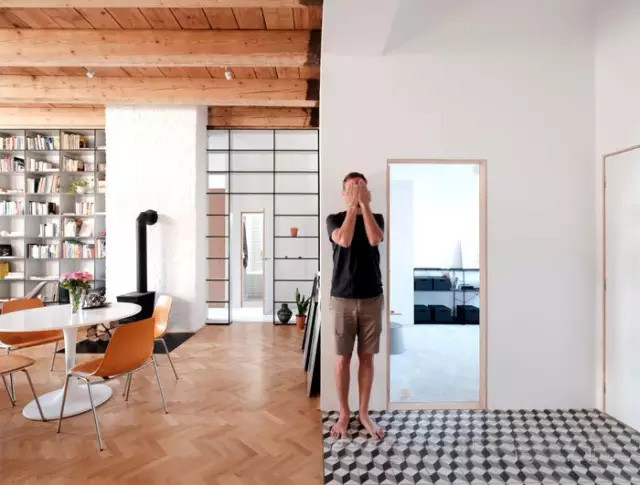
TRN Flat is located in a building in the 1719 building, the start of a monastery in the middle of the twentieth Century was converted into an apartment building, when the current owner bought here, hired JRKVC for its transformation, hope that this 100 square meters of space, time and budget in limited circumstances, to create clean, fresh, and flexible in the future after the birth of a child with a variable apartment space.
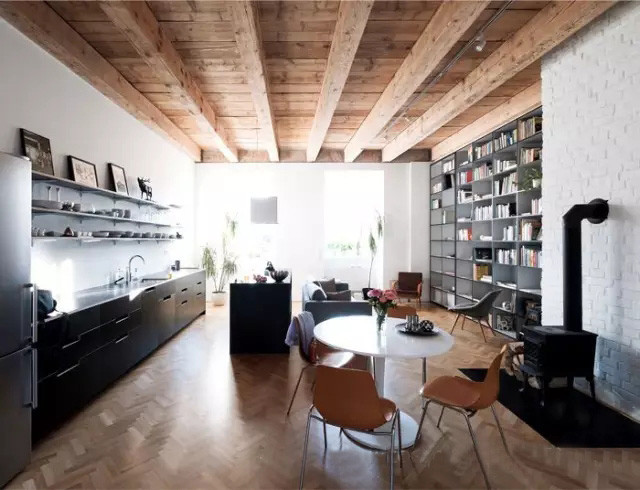
The height of 3.6 meters to allow the designer to have to restore the original old house wooden beams of bold ideas, with the owner after the consultation, recovery and utilization of wood re customize the ceiling , bare stone will be painted into white , split herringbone collage of wooden floor, showing the time of precipitation caused by retro aesthetic.
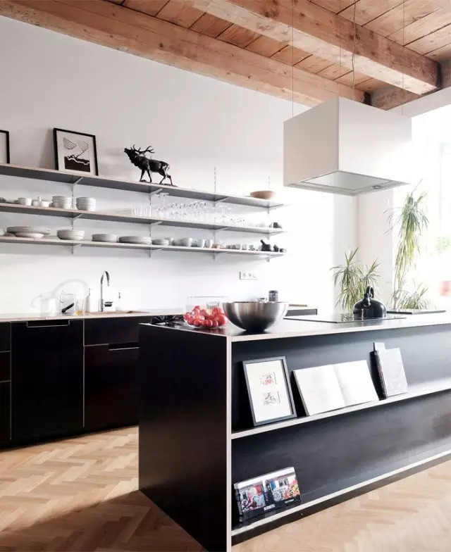
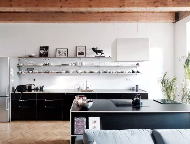
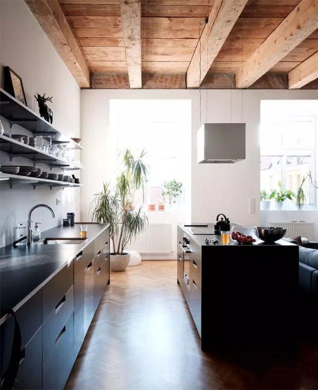
Re-planning the layout of the space, sunlight on the white wall, make indoor appear transparent, bright. Bring a bright color contrast with black cabinets, some debris will affect the appearance of the cabinet on the shelf, put the tableware and decorative painting together in simple shelving, regard them as life ornament, enrich the space temperature.
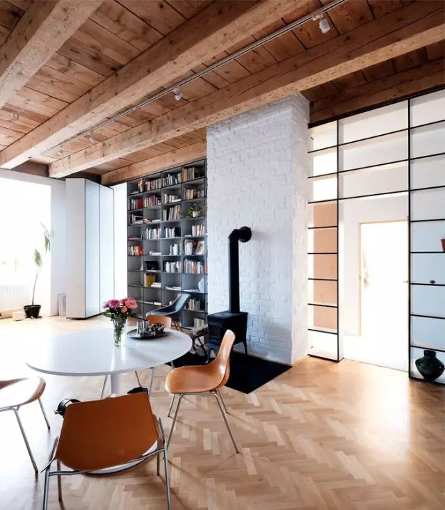
The bright white flowers placed in the table, dining space has a relaxed atmosphere.
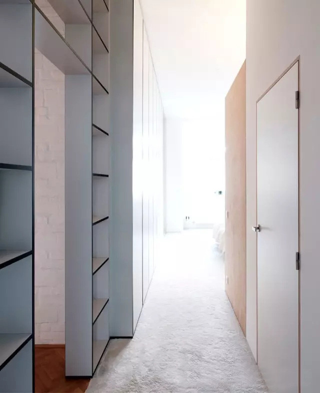
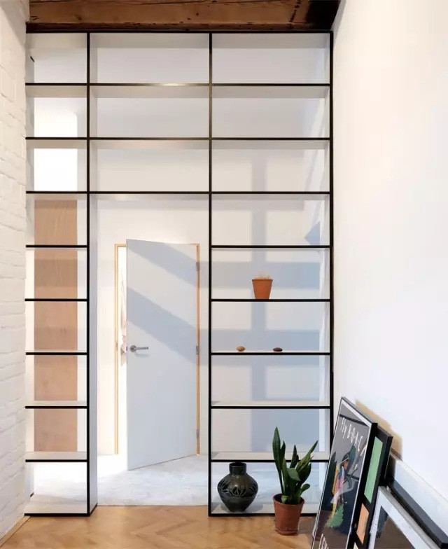
In order to make the space more flexible, designers in space division is very hard, even separate public and private areas of the wall were demolished as part of a rack with hollow instead, create a vaguely interesting visual effect.
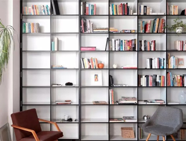
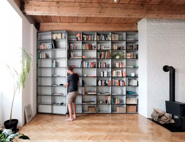
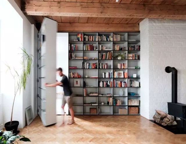
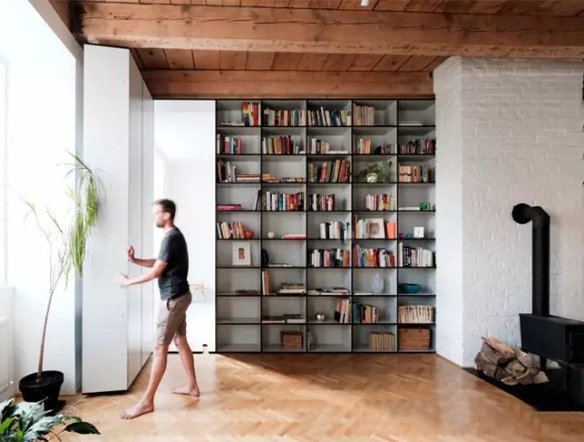
At the other end of the long wall, the whole face of the shelf is very eye-catching, owner’s books or travel souvenirs are used to show the rich color of the small objects to make this a superb collection of beautiful things plain space more than a warm sense of life and with a comfortable atmosphere. Because the owners intends to have their own baby in the future within a few years, so the shelf wall was made of the flexible switch, make the space has more possibilities.
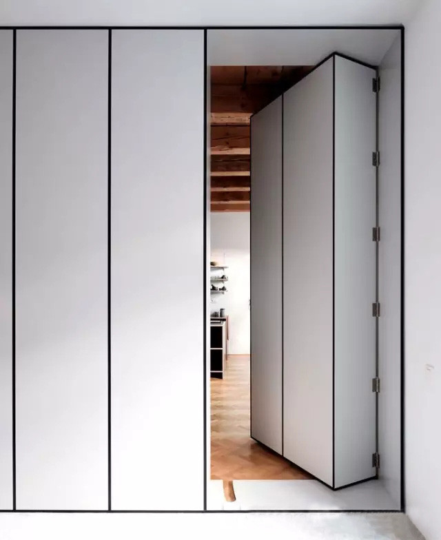
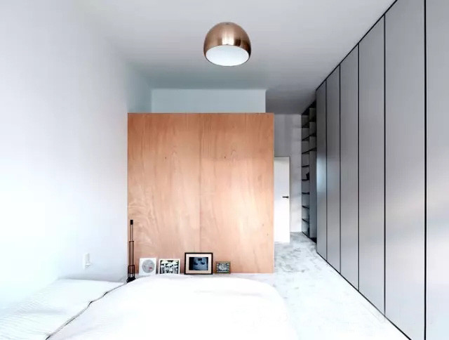
The indoor cabinet extends to the bedroom wall at the end of the owner's clothing or sundries can be placed in this, to reduce visual clutter of the black box side, has simple and neat feeling.
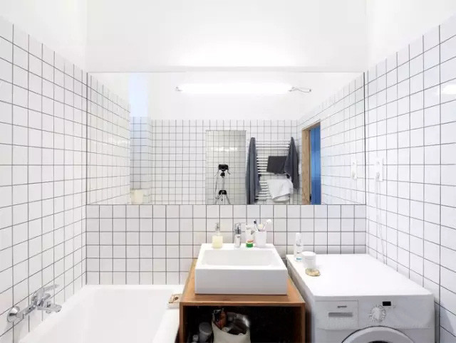
The bathroom area is not spacious, but because of well placed becomes very practical, small white brick to create a clean and thorough visual sense.

